
Discover the loan app user dashboard best design elements that improve trust, usability, engagement, and repayment experiences.
The loan app user dashboard best design elements combine clarity, trust, personalization, and action-focused design. A great dashboard helps users instantly understand their loan status, repayment schedule, eligibility, and financial progress without confusion or unnecessary effort.
A successful dashboard doesn’t just display data, it helps users make confident financial decisions.
The first time I reviewed dozens of loan apps side by side, something surprising stood out.
The apps with the most features weren’t necessarily the easiest to use.
In fact, some of the most powerful lending platforms felt overwhelming the moment the dashboard appeared. Numbers competed for attention. Buttons seemed to fight for space. Important information hid behind multiple taps.
Then I noticed something different in the best-performing experiences.
Their dashboards felt calm.
Not empty. Not simplistic. Just intentional.
The best loan app user dashboard design doesn’t try to impress users with complexity. It removes uncertainty. It answers the questions people have the moment they open the app:
How much do I owe?
When is my next payment?
Am I eligible for more credit?
Is everything on track?
Those questions may sound simple, but answering them effectively can determine whether users trust a lending platform or abandon it entirely.
In a financial product, trust isn’t created through marketing. It’s created through interface decisions.
Let’s explore the design elements that make modern loan dashboards genuinely useful.
Why Loan App Dashboard Design Matters More Than Most Teams Realize
A dashboard is often the most visited screen in a lending application.
Users return repeatedly to monitor repayments, review balances, check loan status, and manage their finances.
Research across fintech products consistently shows that users engage more frequently when dashboards answer their primary questions immediately rather than forcing exploration. Financial platforms that prioritize information hierarchy tend to improve retention and user confidence.
A dashboard is not merely a summary page.
It’s the user’s financial control center.
Every design decision either reduces uncertainty or creates it.
That’s a powerful responsibility.
The Core Goal of a Loan App User Dashboard
Before discussing interface components, it’s important to understand the dashboard’s actual job.
Many product teams make a subtle mistake.
They design dashboards around available data.
Successful teams design dashboards around user intent.
What Users Actually Want
Most borrowers open a loan app to answer one of these questions:
- What is my outstanding balance?
- When is my next payment due?
- How much have I already paid?
- Can I apply for another loan?
- Is my repayment status healthy?
- Are there any actions I need to take?
Everything else is secondary.
The best dashboards answer these questions within seconds.
Clear Loan Overview: The Most Important Dashboard Element
The first thing users should see is a concise loan summary.
This section acts as the dashboard’s anchor.
Essential Information to Display
Outstanding Balance
The remaining loan amount should be immediately visible.
Users should never need multiple taps to find it.
Next Due Date
The upcoming payment date deserves prominent placement.
Missing a payment creates anxiety. Visibility reduces that risk.
EMI or Installment Amount
Users should understand their upcoming financial obligation instantly.
Loan Status
Simple labels work best:
- Active
- Paid
- Overdue
- Processing
- Approved
Complex terminology adds friction.
Why It Matters
Think of this section as the dashboard’s front door.
If users can’t find their loan status quickly, every other feature becomes less valuable.
Smart Visual Hierarchy Creates Instant Understanding
One of the biggest mistakes in lending dashboards is treating all information equally.
Not all information deserves equal attention.
Visual hierarchy helps users focus on what matters first.
Effective Hierarchy Principles
Large Primary Numbers
Outstanding balance and next payment should dominate the screen.
Secondary Information
Interest rates, account details, and historical records should support, not compete with, primary data.
Consistent Spacing
Whitespace isn’t wasted space.
It’s a navigation tool.
Users process information faster when content has room to breathe.
Quotable Insight
“Users rarely abandon financial apps because of missing features. They leave when finding critical information feels like work.”
Repayment Progress Visualization
Numbers tell users where they are.
Progress indicators tell users where they’re going.
This distinction matters.
Effective Progress Components
Loan Completion Tracker
A visual progress bar helps users understand repayment progress.
Example:
- Loan Repaid: 65%
- Remaining: 35%
The concept is simple.
The psychological impact is significant.
Milestone Indicators
Show meaningful achievements:
- 25% Repaid
- 50% Repaid
- 75% Repaid
- Fully Repaid
Progress motivates consistency.
Why Humans Respond to Progress
People naturally complete journeys they can visualize.
A repayment tracker transforms debt from a vague burden into a measurable goal.
Payment Actions Must Be Impossible to Miss
Many loan apps bury repayment actions behind menus.
That’s a costly mistake.
The primary action should always remain accessible.
Essential Action Buttons
- Pay Now
- Schedule Payment
- Enable Auto-Debit
- View Repayment History
Design Principle
Actions should appear exactly when users need them.
Not hidden in navigation layers.
Transaction History That Tells a Story
Many financial apps display transaction lists.
The best dashboards provide transaction context.
What Good Transaction Design Includes
- Payment date
- Amount paid
- Payment method
- Status confirmation
- Reference number
Better Than Raw Data
Instead of:
“Payment Received”
Display:
“₹5,000 EMI successfully received on June 5. Remaining balance: ₹45,000.”
Context builds confidence.
Personalized Loan Insights
Modern dashboards should do more than report information.
They should interpret it.
Examples of Useful Insights
Repayment Health
- Excellent repayment record
- On-time payment streak
- No overdue installments
Credit Growth Opportunities
- Eligible for higher loan limit
- Pre-approved offers available
Savings Opportunities
- Pay early and reduce interest
These insights transform the dashboard from a tracker into an advisor.
Trust Signals That Reduce User Anxiety
Loan products involve money, identity verification, and sensitive information.
Trust must be visible.
Important Trust Elements
Security Indicators
- Biometric login enabled
- Account secured
- Encryption notices
Transparent Fee Information
Hidden fees destroy trust.
Visible fee structures create confidence.
Loan Agreement Access
Users should access documents whenever needed.
Quotable Insight
“In lending products, transparency often matters more than visual beauty.”
Notification Design That Helps Instead of Distracts
Financial apps often overwhelm users with alerts.
The best dashboards prioritize relevance.
High-Value Notifications
- Upcoming Payment Reminders
- Successful Payment Confirmations
- Eligibility Updates
Low-Value Notifications
- Excessive promotions
- Repeated reminders
- Generic announcements
Users quickly learn to ignore noise.
Mobile-First Design Is No Longer Optional
Most loan app interactions occur on smartphones.
Yet some dashboards still feel adapted from desktop experiences.
Mobile Dashboard Priorities
Thumb-Friendly Navigation
Important actions should sit within natural reach zones.
Large Tap Targets
Financial transactions require confidence.
One-Hand Usability
Many users check finances while commuting or multitasking.
Every interaction should accommodate real-world behavior.
Accessibility as a Competitive Advantage
Accessibility improves usability for everyone.
Not just users with disabilities.
Key Accessibility Features
- High Contrast Text
- Adjustable Font Sizes
- Screen Reader Compatibility
- Clear Labels
An accessible dashboard often feels more intuitive to all users.
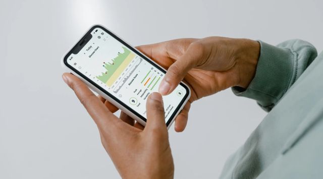
Intelligent Data Visualization
Financial data can become overwhelming quickly.
Good visualization simplifies complexity.
Best Dashboard Charts
- Repayment Trend Lines
- Payment History Graphs
- Balance Reduction Charts
Avoid
- Overly decorative graphs
- Excessive colors
- Complex financial jargon
Good visualization clarifies.
Bad visualization distracts.
Personalization Makes Dashboards Feel Human
Not every borrower has identical needs.
A first-time borrower behaves differently from a repeat customer.
Useful Personalization Features
Dynamic Home Screens
Prioritize information based on behavior.
Custom Dashboard Widgets
Allow users to reorder priorities.
Contextual Recommendations
Offer relevant actions instead of generic promotions.
Personalization creates relevance.
Relevance drives engagement.
Comparison: Basic vs Exceptional Loan Dashboard Design
| Design Area | Basic Dashboard | Exceptional Dashboard |
| Loan Summary | Static numbers | Clear visual overview |
| Repayment Tracking | Text-only data | Progress visualization |
| Notifications | Generic alerts | Context-aware reminders |
| User Actions | Hidden menus | Visible primary actions |
| Insights | Raw information | Actionable guidance |
| Trust Signals | Minimal presence | Constant reassurance |
| Personalization | Same for everyone | Adaptive experiences |
| Accessibility | Basic compliance | Inclusive design |
Common Loan Dashboard Mistakes
Too Much Information
Financial apps often confuse completeness with usefulness.
Users want clarity first.
Promotion Overload
Loan offers should never overshadow existing loan management.
Poor Navigation
Critical actions should not require multiple taps.
Unclear Status Updates
Users should instantly understand whether payments succeeded or failed.
Inconsistent Design Language
Visual inconsistency creates uncertainty.
Uncertainty damages trust.
The Future of Loan App User Dashboards
Loan dashboards are evolving from monitoring tools into financial guidance platforms.
Emerging trends include:
AI-Powered Recommendations
Personalized repayment suggestions.
Predictive Alerts
Warnings before payment issues occur.
Financial Wellness Scores
Helping users understand broader financial health.
Conversational Dashboard Interfaces
Users asking questions naturally:
“How much interest can I save by paying early?”
The dashboard then provides immediate answers.
The future isn’t about more data.
It’s about better interpretation.
FAQ Section
What are the most important loan app user dashboard design elements?
The most important elements include loan balance visibility, repayment schedules, progress tracking, payment actions, trust indicators, and personalized insights.
Why is visual hierarchy important in a loan dashboard?
Visual hierarchy helps users identify critical information quickly, reducing confusion and improving financial decision-making.
How can a loan dashboard improve user retention?
A dashboard that answers user questions immediately encourages repeat engagement and strengthens trust in the lending platform.
Should loan dashboards include personalized recommendations?
Yes. Personalized insights can help users understand eligibility, repayment opportunities, and financial progress more effectively.
What is the biggest mistake in loan dashboard design?
The biggest mistake is overwhelming users with excessive information instead of prioritizing the most important financial actions and insights.
Key Takings
- The loan app user dashboard best design elements focus on clarity before complexity.
- Outstanding balance and next payment information should be visible immediately.
- Progress tracking increases user motivation and repayment confidence.
- Trust signals are essential in financial products where uncertainty affects behavior.
- Personalized insights transform dashboards from reporting tools into guidance platforms.
- Mobile-first design improves usability because most loan interactions occur on smartphones.
- Successful loan dashboards prioritize user questions instead of simply displaying data.


