Build a memorable towing and recovery company branding visual identity that earns trust, attracts customers, and strengthens your business.
A towing and recovery company branding visual identity is the complete visual representation of a towing business, including its logo, colors, typography, vehicle graphics, uniforms, website, and marketing materials. A consistent visual identity builds trust, improves recognition, and helps customers choose your company during stressful roadside emergencies.
When someone is stranded on the side of the road, they rarely have the luxury of comparing dozens of towing companies. They usually choose the business that looks the most trustworthy, professional, and legitimate within seconds.
That realization changes how branding should be viewed in the towing industry. A logo isn’t just decoration. A truck wrap isn’t simply advertising. Every visual detail becomes part of a customer’s first impression before a driver even arrives.
Many towing companies invest heavily in equipment, dispatch software, and skilled operators while overlooking one of their strongest competitive advantages: a memorable visual identity. Yet customers often remember what they saw long before they remember what they were told.
A well-designed branding system creates confidence, reinforces professionalism, and helps a towing company stand apart in a highly competitive local market.
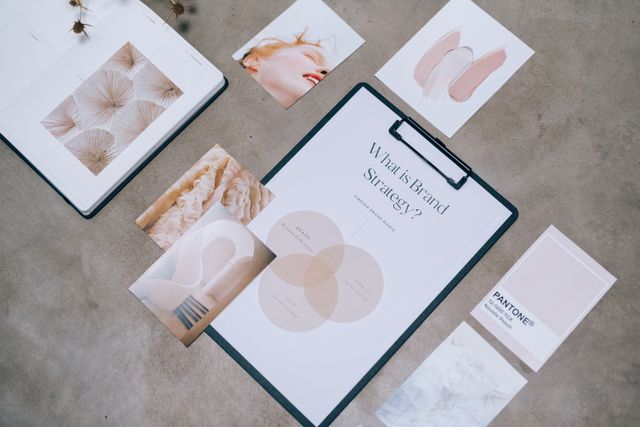
What Is a Towing and Recovery Company Branding Visual Identity?
A towing and recovery company branding visual identity is the collection of visual elements that consistently represent a business across every customer interaction.
It typically includes:
- Company logo
- Brand colors
- Typography
- Truck wraps
- Uniforms
- Business cards
- Website design
- Social media graphics
- Fleet numbering
- Safety decals
- Office signage
- Digital advertisements
Instead of existing as separate pieces, these elements work together to create a recognizable brand experience.
Quote-worthy insight:
A consistent visual identity helps customers recognize a towing company before they even read its name.
Why Branding Matters More Than Many Towing Companies Realize
Unlike many industries, towing businesses often meet customers during stressful situations.
Flat tires.
Breakdowns.
Accidents.
Vehicle recovery.
People naturally look for signs that suggest professionalism and reliability.
Imagine two tow trucks arriving at different scenes.
The first has faded paint, multiple fonts, peeling decals, and no consistent branding.
The second has clean graphics, reflective lettering, matching uniforms, and a professional logo.
Most customers immediately assume the second company is more organized—even before speaking to the driver.
That perception influences trust, referrals, and online reviews.
The Core Elements of a Strong Visual Identity
A Memorable Logo
Your logo should remain clear whether it’s printed on:
- Heavy-duty tow trucks
- Business cards
- Uniforms
- Invoices
- Social media profiles
Avoid overly detailed artwork.
Simple, bold logos remain recognizable from hundreds of feet away.
Color Palette
Colors influence emotion faster than words.
Popular choices include:
- Red for urgency and strength
- Blue for reliability and trust
- Black for authority
- Yellow for visibility and caution
- Orange for safety and energy
The best brands consistently use two or three primary colors across every platform.
Typography
Fonts communicate personality.
A heavy sans-serif font often works well because it appears strong, readable, and dependable.
Using too many fonts creates visual confusion.
Consistency always wins.
Fleet Graphics
Tow trucks act as moving billboards.
Every vehicle should display:
- Company logo
- Phone number
- Website
- License information
- Service area
- Consistent colors
Clean truck graphics increase brand exposure every time the vehicle enters traffic.
Driver Uniforms
Drivers represent the brand in person.
Matching uniforms with embroidered logos instantly increase professionalism.
Customers feel more comfortable approaching someone who looks official.
Consistency Is the Secret Ingredient
Many businesses have attractive logos.
Far fewer apply them consistently.
Brand consistency means customers encounter the same visual language everywhere.
Website.
Facebook page.
Tow trucks.
Invoices.
Emails.
Uniforms.
Even safety equipment.
Consistency builds familiarity.
Familiarity builds trust.
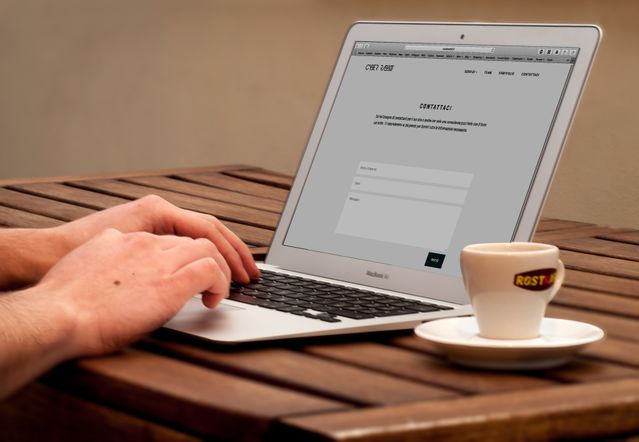
Digital Branding Matters Just as Much
Today’s customers often search online before calling.
If your website looks outdated while your trucks look modern, customers receive mixed signals.
Your digital identity should match your physical branding.
This includes:
- Mobile-friendly website
- Consistent colors
- Professional photography
- Easy navigation
- Clear contact information
- Local service pages
A polished online presence reinforces the confidence customers felt when they first noticed your trucks.
Common Branding Mistakes
Many towing businesses unintentionally weaken their brand.
Common mistakes include:
- Using multiple logo versions
- Changing colors frequently
- Low-quality truck graphics
- Outdated websites
- Poor-quality photos
- Inconsistent social media branding
- Difficult-to-read lettering
- Generic stock logos
Brand inconsistency makes even experienced companies appear less established.
Branding Is More Than a Logo
Some owners believe branding begins and ends with designing a logo.
In reality, branding includes every visual interaction customers have with the company.
Even details like:
- Invoice design
- Email signatures
- Employee appearance
- Vehicle cleanliness
- Office signage
- Safety equipment
All communicate something about the business.
Customers notice far more than many owners expect.
Comparing Strong and Weak Visual Identity
| Strong Branding | Weak Branding |
| Consistent logo | Multiple logo versions |
| Matching truck graphics | Different designs on every vehicle |
| Professional uniforms | No branded clothing |
| Clean website | Outdated website |
| Consistent colors | Random color combinations |
| High-quality photography | Blurry stock images |
How to Build a Professional Towing Brand
A practical branding process includes:
- Define your company’s personality.
- Design a memorable logo.
- Select two or three primary brand colors.
- Choose consistent typography.
- Create professional truck wraps.
- Standardize uniforms.
- Build a modern website.
- Use the same visual style across social media.
- Develop simple brand guidelines.
- Review and update branding regularly.
Strong brands evolve without losing their identity.
Frequently Asked Questions
What is a towing and recovery company branding visual identity?
It is the complete visual system that represents a towing business, including its logo, colors, typography, vehicle graphics, uniforms, website, and marketing materials.
Why is branding important for towing companies?
Branding helps customers recognize, trust, and remember a company, especially during stressful roadside situations where quick decisions are common.
How often should branding be updated?
Minor updates can keep the brand modern every few years, while maintaining consistent core elements to preserve recognition.
What colors work best for towing companies?
Red, blue, black, yellow, and orange are popular because they communicate trust, visibility, strength, and safety.
Does visual identity affect customer trust?
Yes. A clean, consistent visual identity often creates an immediate impression of professionalism, reliability, and attention to detail.
Key Takings
- A towing and recovery company branding visual identity is much more than just a logo.
- Consistent branding builds trust before customers even make a phone call.
- Professional fleet graphics, uniforms, and websites reinforce credibility.
- Simple, recognizable visual elements outperform overly complicated designs.
- Every customer touchpoint contributes to brand perception.
- Strong branding helps towing companies stand out in competitive local markets.
- Investing in visual identity is an investment in long-term customer recognition and business growth.


