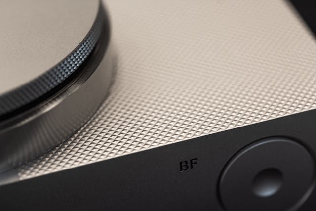
Learn how to create a realistic css metal gradient button effect with modern CSS techniques, depth, shine, and animation.
A CSS metal gradient button effect uses layered gradients, shadows, highlights, and subtle reflections to simulate the appearance of brushed steel, chrome, aluminum, or other metallic surfaces. Modern CSS allows these effects to be created without image files, making buttons scalable, responsive, and lightweight.
The first time I tried building a metallic button with CSS, I assumed it would require Photoshop textures, SVG overlays, or some complicated graphics trick.
I was wrong.
What surprised me wasn’t that CSS could imitate metal. It was how convincingly it could do it. A few gradients. A handful of shadows. Carefully placed highlights. Suddenly a flat rectangle started behaving like an object that belonged in the physical world.
That’s really what makes the css metal gradient button effect fascinating. It sits at the intersection of design psychology and code. We know screens are flat, yet our brains still react to reflections, depth, and light as if they were real.
The deeper I explored metallic UI design, the more I realized something interesting: the best metal buttons aren’t trying to look flashy. They’re trying to fool your eyes just enough to feel tangible.
Let’s break down exactly how that works.
Understanding the CSS Metal Gradient Button Effect
A css metal gradient button effect recreates the visual properties of metal using CSS backgrounds, gradients, shadows, and lighting techniques.
Unlike ordinary gradient buttons, metallic buttons depend on contrast patterns that mimic how light interacts with reflective surfaces. Modern CSS gradient functions make this possible without relying on images.
Think of it like painting with light rather than color.
Real metal isn’t a single shade.
It’s a collection of highlights, reflections, dark bands, and transitions that constantly shift depending on viewing angle.
That’s exactly what a metallic button attempts to reproduce.
What Makes Metal Look Like Metal?
Three visual characteristics create the illusion.
Reflective Highlights
Metal reflects light intensely.
This creates bright streaks and concentrated highlights across the surface.
Strong Contrast
Plastic often appears soft.
Metal appears sharp.
The transitions between light and dark regions tend to be more dramatic.
Layered Reflections
Real metallic surfaces rarely display one simple gradient.
They contain multiple reflection zones that overlap.
Modern CSS allows multiple gradients to be stacked on top of one another, enabling sophisticated lighting effects without image assets.
Why Metallic Buttons Continue to Work
Design trends come and go.
Skeuomorphism faded.
Flat design took over.
Then neumorphism arrived.
Yet metallic buttons keep returning.
Why?
Because humans instinctively understand physical materials.
A chrome button suggests durability.
A brushed steel button suggests precision.
A gold button suggests value.
These visual cues operate beneath conscious thought.
Users don’t usually say, “I trust this because it looks metallic.”
But their brains notice.
The button feels substantial.
And that feeling matters.
The Core Building Blocks of a CSS Metal Gradient Button Effect
Linear Gradients
Linear gradients form the foundation of most metallic surfaces.
They create directional lighting patterns that imitate reflective materials.
A typical metallic palette might include:
- Light silver
- Medium gray
- Dark gray
- Near-white highlights
Example:
background: linear-gradient(
to bottom,
#f5f5f5,
#d4d4d4,
#8f8f8f,
#d9d9d9
);
Notice something?
The colors don’t move smoothly from light to dark.
They bounce back and forth.
That’s intentional.
Real metal reflects unevenly.
Radial Gradients
Linear gradients create direction.
Radial gradients create localized reflections.
These reflections act like tiny light sources sitting on top of the button.
Example:
background:
radial-gradient(
circle at 30% 20%,
rgba(255,255,255,.8),
transparent 40%
);
This creates a soft reflective hotspot.
Creating Depth with Shadows
A metallic button without shadows feels strangely fake.
Even perfect gradients can appear flat if they lack dimensional cues.
Outer Shadows
Outer shadows lift the button above the page.
box-shadow:
0 4px 10px rgba(0,0,0,.3);
Inner Shadows
Inner shadows create surface curvature.
box-shadow:
inset 0 1px 1px rgba(255,255,255,.7),
inset 0 -2px 4px rgba(0,0,0,.25);
Many advanced CSS button designs rely on multiple layered shadows rather than a single shadow effect.
Building a Brushed Aluminum Button
Among all metal styles, brushed aluminum remains one of the easiest to implement.
Why?
Because aluminum has subtle reflections.
It doesn’t demand mirror-like chrome accuracy.
Visual Characteristics
- Soft silver tones
- Gentle highlights
- Low saturation
- Fine directional texture
Example:
.aluminum-btn {
background:
linear-gradient(
to bottom,
#f4f4f4,
#d8d8d8,
#bdbdbd,
#e6e6e6
);
border: 1px solid #9a9a9a;
box-shadow:
inset 0 1px 0 rgba(255,255,255,.9),
inset 0 -2px 3px rgba(0,0,0,.15),
0 3px 6px rgba(0,0,0,.25);
}
The result feels industrial without looking exaggerated.
Creating Chrome-Like Reflections
Chrome is different.
It isn’t subtle.
Chrome wants attention.
The challenge is that most attempts end up looking like silver plastic rather than reflective metal.
The Secret
Use aggressive color stop transitions.
Example:
background:
linear-gradient(
to bottom,
#ffffff 0%,
#f2f2f2 15%,
#777777 40%,
#ffffff 50%,
#666666 65%,
#f7f7f7 100%
);
The dramatic shifts create reflection bands.
Those bands trick the eye into perceiving mirror-like surfaces.
Gold Metallic Button Effects
Gold introduces a new challenge.
Color.
With silver and chrome, brightness carries most of the illusion.
Gold requires hue management.
Effective Gold Palette
#fff5b5
#ffd700
#d4af37
#996515
The trick isn’t making gold yellow.
It’s balancing warm highlights with darker amber shadows.
Too much yellow and the button starts looking like a toy.
Hover Effects That Feel Physical
Most hover animations move buttons.
Metallic buttons should respond to light.
That subtle distinction changes everything.
Light Shift Hover
button:hover {
filter: brightness(1.1);
}
Reflection Movement
button:hover {
background-position: center top;
}
Pressed Metal Effect
button:active {
transform: translateY(2px);
}
When a metallic button depresses slightly, users perceive it as mechanical rather than digital.
That’s a surprisingly powerful interaction cue.
Using Multiple Gradient Layers
This is where metallic effects become genuinely convincing.
Many beginners use one gradient.
Experienced designers stack several.
Example:
background:
radial-gradient(
circle at top,
rgba(255,255,255,.8),
transparent 40%
),
linear-gradient(
to bottom,
#f4f4f4,
#999999
);
One gradient creates reflection.
The other creates material.
Together they create metal.
Advanced Techniques for Hyper-Realistic Metal Buttons
Once the basic effect works, the next challenge is realism.
This is where most metallic buttons separate into two groups.
Some look like colored rectangles.
Others look like objects.
The difference usually comes down to detail.
Adding Pseudo-Element Highlights
Pseudo-elements can simulate reflections moving across a surface.
button::before {
content: “”;
position: absolute;
inset: 2px;
background: linear-gradient(
rgba(255,255,255,.6),
transparent
);
}
This creates a subtle reflective sheen that feels closer to real metal.
Using Border Gradients
Many designers focus entirely on the center of the button.
The edges matter just as much.
Real metal catches light around corners and borders.
Creating brighter upper borders and darker lower borders strengthens the illusion of depth.
Simulating Brushed Metal Texture
Texture can be suggested without images.
Tiny repeating gradients can mimic brushed metal grain.
background:
repeating-linear-gradient(
90deg,
rgba(255,255,255,.03),
rgba(255,255,255,.03) 1px,
rgba(0,0,0,.03) 2px
);
The effect is subtle.
That’s exactly why it works.
The Rise of Animated Metallic Buttons
Something interesting has happened recently.
Designers have started treating metallic buttons less like objects and more like living surfaces.
Animated gradients and moving highlights are becoming increasingly common in premium interfaces.
Why Animation Works
Real metal changes appearance when either:
- The object moves
- The light moves
- The viewer moves
Animation simulates all three.
Even tiny movement can make a button feel dramatically more realistic.
Example Shine Animation
@keyframes shine {
from {
background-position: -200px;
}
to {
background-position: 200px;
}
}
A slow-moving highlight often feels more premium than a fast one.
Patience creates luxury.
Speed creates distraction.
Common Mistakes
Too Many Colors
Real metal isn’t rainbow-colored.
Limit your palette.
Excessive Shine
Beginners often maximize highlights.
Ironically, this reduces realism.
Missing Shadows
Reflections without shadows create confusion.
Metal requires both.
Ignoring Interaction States
Static metal feels unfinished.
Hover and active states complete the illusion.
Overusing Blur
Too much blur softens the surface.
Metal should feel crisp.
Sharp transitions are part of what makes metal look metallic.
CSS Metal Gradient Button Effect Comparison
| Style | Appearance | Difficulty | Best Use Case |
| Aluminum | Soft and industrial | Easy | Dashboards |
| Chrome | Highly reflective | Advanced | Premium interfaces |
| Steel | Strong and durable | Medium | Control panels |
| Titanium | Modern and technical | Advanced | Tech products |
| Gold | Luxurious and warm | Medium | Premium CTAs |
Performance Benefits Over Images
One of the biggest advantages of CSS-generated metallic buttons is performance.
Gradients are rendered directly by the browser.
This means they remain sharp at every screen size.
No pixelation.
No additional image requests.
No scaling issues.
Why This Matters
Every image adds weight.
Every HTTP request adds time.
CSS gradients reduce both.
That means faster loading interfaces and smoother user experiences.
Quotable Fact
“CSS gradients scale infinitely without losing visual quality.”
Quotable Fact
“Layered gradients can replace image-based metallic textures in many modern interfaces.”
Quotable Fact
“Most realistic metallic buttons rely on a combination of gradients, highlights, and shadows rather than graphic assets.”
The Psychology Behind Metallic Interfaces
This part surprised me the most.
Metallic buttons aren’t merely decorative.
They’re communicative.
A brushed steel button feels dependable.
A chrome button feels futuristic.
A gold button feels exclusive.
The underlying CSS might be identical.
Only the visual language changes.
That’s design at its most subtle.
Tiny changes in gradients create entirely different emotional reactions.
And users rarely notice why.
They simply feel it.
Material Perception Matters
Humans are constantly making judgments about materials.
We estimate weight.
We estimate durability.
We estimate value.
A metallic button quietly influences all three.
That’s why certain financial apps, automotive dashboards, luxury websites, and industrial control systems continue to use metallic interface elements.
They signal trust.
Not through words.
Through texture.
When You Should Use a CSS Metal Gradient Button Effect
Metallic buttons aren’t right for every project.
Minimalist interfaces often benefit from flatter designs.
But certain contexts naturally support metallic styling.
Great Use Cases
- Automotive websites
- Industrial software
- Gaming interfaces
- Luxury products
- Premium subscriptions
- Technology brands
- Hardware dashboards
Less Effective Use Cases
- Children’s websites
- Organic lifestyle brands
- Simple blog layouts
- Minimal productivity apps
Design isn’t about using every effect.
It’s about using the right effect.
FAQ
What is a css metal gradient button effect?
It is a button design technique that uses gradients, shadows, and highlights to simulate metallic materials such as steel, aluminum, chrome, or gold.
Can metallic buttons be created without images?
Yes. Modern CSS gradients, shadows, pseudo-elements, and animations can create realistic metallic effects without external image assets.
Which gradient type works best for metal effects?
Linear gradients provide the primary metallic surface, while radial gradients add reflective highlights. Combining both usually produces the most realistic result.
Are animated metallic buttons performance-friendly?
Generally yes. CSS animations and gradients are rendered efficiently by modern browsers and often outperform image-based alternatives.
What metal style is easiest for beginners?
Brushed aluminum is usually the easiest because its reflections are softer and more forgiving than chrome or polished steel.
Can metallic buttons work in modern UI design?
Absolutely. When used selectively, metallic buttons can create premium, tactile experiences while maintaining modern design standards.
Key Takings
- A css metal gradient button effect recreates metallic surfaces using gradients, shadows, and highlights.
- Layered gradients produce significantly more realistic results than a single gradient.
- Linear gradients establish material direction while radial gradients simulate reflections.
- Multiple shadow layers create depth and physical presence.
- Chrome effects require stronger contrast than aluminum effects.
- Hover states should simulate changing light rather than simple movement.
- CSS-generated metallic buttons remain scalable, responsive, and lightweight.
- Pseudo-elements and animated reflections can dramatically improve realism.
- Texture is often suggested rather than explicitly drawn.
- The best metallic buttons communicate value, precision, and trust.
Additional Resources
- MDN Web Guide CSS Gradients: Comprehensive documentation explaining gradient systems, layering techniques, and modern browser implementation.
