Master swimlane row header design patterns kanban teams use to improve clarity, workflow visibility, and board usability.
Swimlane row header design patterns in Kanban are the methods used to label and structure swimlanes so teams can instantly understand what type of work belongs in each row. Effective headers improve navigation, reduce confusion, and make complex boards easier to manage at scale.
I used to think the most important part of a Kanban board was the cards.
That assumption lasted until I joined a project where nobody seemed able to find anything despite having hundreds of carefully maintained cards. Tasks were updated. Priorities were tracked. Statuses were accurate. Yet every planning session felt like searching for a flashlight in a room filled with flashlights.
Then I noticed something strange.
The teams with the most organized boards weren’t necessarily managing their cards better. They were organizing their swimlanes better.
More specifically, they were designing their swimlane row headers with intention.
It sounds almost too simple. After all, a row header is just a label sitting on the side of a board. How much impact can a label really have?
As it turns out, quite a lot.
A swimlane row header acts like a map legend. It tells everyone how to interpret the information in front of them. When designed well, it disappears into the experience because everything feels obvious. When designed poorly, the entire board becomes harder to understand regardless of how well the rest of the system works.
This guide explores swimlane row header design patterns in Kanban from both practical and strategic perspectives. We’ll examine what makes certain patterns successful, where common mistakes emerge, and how organizations can create swimlane structures that remain useful as teams grow.
Understanding Swimlane Row Header Design Patterns in Kanban
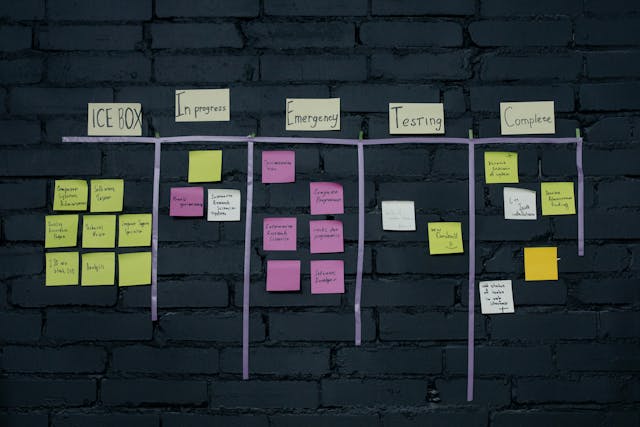
Before discussing design patterns, it’s important to understand the purpose of a swimlane.
A swimlane creates horizontal segmentation within a Kanban board.
Columns typically represent workflow stages.
Swimlanes represent categories of work.
That distinction changes everything.
Columns answer:
“Where is the work?”
Swimlanes answer:
“What kind of work is this?”
The row header becomes the visible explanation for that categorization.
Without a clear header, users must repeatedly interpret and re-interpret the board.
With a clear header, understanding becomes immediate.
Why Swimlane Headers Matter
Most organizations underestimate the influence of swimlane headers because they seem static.
Cards move.
Columns change.
Metrics update.
Headers just sit there.
Yet those static elements become the framework through which every piece of information is interpreted.
A poorly designed header creates friction every time someone looks at the board.
A well-designed header eliminates friction thousands of times each month.
Quotable Insight:
“Users should understand a swimlane’s purpose within two seconds of seeing its header.”
That may sound like a strict requirement.
It isn’t.
In visual systems, speed of understanding directly affects usability.
The Hidden Psychology of Swimlane Headers
Every Kanban board is a communication tool.
Communication tools either reduce mental effort or increase it.
Good swimlane row headers reduce mental effort.
Bad ones create unnecessary interpretation.
Imagine walking through an unfamiliar airport.
One airport labels terminals clearly.
Another uses internal codes nobody understands.
Both technically provide information.
Only one feels intuitive.
The same principle applies to Kanban design.
Humans naturally prefer recognition over interpretation.
Recognition happens instantly.
Interpretation requires effort.
Great swimlane headers optimize for recognition.
Recognition Creates Momentum
The faster people understand a board, the faster they can act.
Every moment spent deciphering labels is a moment not spent solving problems.
This becomes especially important when:
- New employees join teams
- Stakeholders review work
- Cross-functional collaboration increases
- Organizations scale operations
The best swimlane headers feel obvious even to outsiders.
Core Swimlane Row Header Design Patterns
Functional Ownership Pattern
One of the most common Kanban structures organizes work according to team ownership.
Examples include:
- Engineering
- Design
- Marketing
- Operations
- Customer Success
This pattern succeeds because accountability becomes immediately visible.
Anyone viewing the board can identify who owns what.
Benefits
- Clear responsibility
- Easier reporting
- Strong organizational alignment
- Simple governance
Limitations
Ownership-based swimlanes can unintentionally reinforce silos.
Work becomes grouped by department rather than customer value.
This isn’t always problematic, but it’s worth considering.
Priority-Based Pattern
Some organizations categorize work according to urgency.
Examples include:
- Critical
- High Priority
- Standard
- Low Priority
The appeal is obvious.
People instantly know what matters most.
Benefits
- Immediate visibility
- Faster decision-making
- Easier escalation management
Limitations
Priority inflation eventually becomes a risk.
Many teams slowly classify everything as important.
When every swimlane signals urgency, urgency loses meaning.
Customer-Centric Pattern
Customer-focused organizations often organize swimlanes around audience segments.
Examples:
- Enterprise Clients
- Strategic Accounts
- Internal Customers
- Small Business Customers
This structure aligns work directly with business impact.
It also helps teams understand where resources are being invested.
Service Class Pattern
This pattern originates from mature Kanban practices.
Examples:
- Expedite
- Fixed Date
- Standard
- Intangible
Unlike organizational categories, service classes focus on flow characteristics.
The result is often better workflow management and more effective prioritization.
Designing Swimlane Headers for Human Brains
Technology evolves constantly.
Human cognition evolves slowly.
Many design decisions become easier when viewed through that lens.
Use Familiar Language
Simple language wins surprisingly often.
Compare these examples:
Poor:
- Strategic Enhancement Requests
Better:
- Improvements
Poor:
- Operational Incident Management
Better:
- Incidents
Short labels reduce scanning time.
Short labels also age better.
Maintain Consistency
Visual consistency creates trust.
If one header contains two words and another contains twelve, users subconsciously perceive disorder.
Balanced formatting improves comprehension.
Consistency isn’t glamorous.
It’s effective.
Lead With Meaning
People scan from left to right.
Place important information first.
Instead of:
- Requests From Enterprise Customers
Consider:
- Enterprise Requests
The second version communicates the same information faster.
The Sticky Header Pattern
As digital Kanban boards become larger, context becomes easier to lose.
Users scroll horizontally.
Columns extend endlessly.
Information spreads across multiple screens.
Without sticky row headers, users often forget which swimlane they’re viewing.
Sticky headers solve this elegantly.
The swimlane label remains visible while users navigate.
Why Sticky Headers Work
Think about reading a spreadsheet.
Imagine row labels disappearing every time you scroll.
Navigation would become frustrating almost immediately.
Kanban boards face the same challenge.
Sticky headers preserve orientation.
They reduce mistakes.
They improve confidence.
Most importantly, they prevent context loss.
Color-Coded Swimlane Header Patterns
Color is one of the most powerful tools available to interface designers.
It is also one of the most abused.
Effective Color Usage
Color should reinforce meaning.
Examples:
- Red = Critical
- Orange = Elevated Risk
- Green = Stable Operations
- Blue = Standard Workflow
Users gradually learn these associations.
Recognition becomes automatic.
Common Color Mistakes
Many teams introduce colors without a system.
Soon the board contains:
- Bright red
- Bright blue
- Bright green
- Bright orange
- Bright purple
- Bright yellow
At that point color stops communicating.
It starts competing.
Good color systems reduce noise.
Bad color systems create it.
Accessibility Considerations
Not all users perceive color the same way.
Never rely exclusively on color to communicate meaning.
Labels should remain understandable even if color disappears entirely.
Icon-Based Swimlane Header Design
Icons offer a fascinating advantage.
They compress meaning.
A shield instantly suggests security.
A bug suggests defects.
A user suggests customer-related work.
A lightning bolt suggests urgency.
Icons speed recognition.
The Icon Plus Text Formula
The most effective pattern combines:
Icon + Label
For example:
🐞 Defects
🛡 Security
👤 Customer Requests
⚡ Expedite
This approach provides both visual and textual understanding.
Users receive multiple paths to comprehension.
Dynamic Swimlane Headers
Modern Kanban platforms increasingly support dynamic information.
Instead of static labels, headers can display live metrics.
Examples:
- Incidents (14)
- Customer Requests (37)
- Blocked Work (5)
The header becomes more than a category.
It becomes a status indicator.
Benefits
Dynamic headers improve situational awareness.
Teams gain immediate visibility into workload distribution.
Leaders identify bottlenecks faster.
Operational decisions become easier.
Risks
More information isn’t always better.
Too many metrics create visual clutter.
The goal is insight.
Not distraction.
Swimlane Headers and Information Architecture
Information architecture sounds like a technical concept.
In reality, it simply refers to how information is organized.
Swimlane headers are a critical component of board architecture.
When architecture succeeds:
- Users find information quickly.
- Navigation feels effortless.
- Training requirements decrease.
When architecture fails:
- Search times increase.
- Errors increase.
- Frustration increases.
The swimlane header acts as a structural pillar supporting the entire experience.
Accessibility Principles for Swimlane Headers
Accessibility often enters conversations late.
It should enter them early.
High Contrast Design
Text should remain readable under various conditions.
Poor contrast creates fatigue.
Strong contrast improves usability for everyone.
Screen Reader Compatibility
Headers should make sense when read aloud.
Codes and abbreviations frequently create confusion.
Meaningful labels perform better.
Touch-Friendly Design
Mobile and tablet usage continues growing.
Headers should remain readable on smaller screens.
Designing for accessibility often improves overall usability.
That’s one reason accessibility is rarely a compromise.
Swimlane Header Anti-Patterns
Not every design trend deserves adoption.
Some patterns create more problems than they solve.
The Acronym Trap
Teams often assume everyone understands internal abbreviations.
Examples:
- CRQ
- SRM
- OPS
- EXP
New employees rarely do.
External stakeholders rarely do.
Clarity should outweigh convenience.
The Miscellaneous Lane
Few swimlanes age worse than “Other.”
It starts as a temporary category.
It eventually becomes a black hole.
Anything unclear ends up there.
Meaning gradually disappears.
Over-Categorization
Some boards contain dozens of swimlanes.
The intention is organization.
The result is fragmentation.
Too many categories often create the same confusion as too few.
Decorative Complexity
Fancy gradients.
Oversized graphics.
Excessive styling.
These elements may look impressive initially.
Over time they compete with actual work visibility.
Communication should remain the primary goal.
Comparison of Popular Swimlane Row Header Design Patterns
| Pattern | Best Use Case | Strength | Weakness |
| Functional Ownership | Large Organizations | Clear Accountability | Can Create Silos |
| Priority-Based | Operations Teams | Fast Decision Making | Priority Inflation |
| Customer-Centric | Service Businesses | Business Alignment | Uneven Distribution |
| Service Class | Advanced Kanban Systems | Better Flow Control | Learning Curve |
| Dynamic Headers | Real-Time Environments | Instant Visibility | Potential Noise |
| Icon + Text | Visual Workflows | Fast Recognition | Requires Consistency |
How High-Performing Teams Think About Swimlane Headers
One interesting observation appears repeatedly across successful organizations.
They treat swimlane headers as navigation systems.
Not labels.
Navigation systems.
That mindset changes design decisions.
Instead of asking:
“What should we call this lane?”
They ask:
“How can someone instantly understand this lane?”
The second question produces better outcomes.
Because it focuses on users rather than categories.
Future Trends in Swimlane Row Header Design Patterns Kanban Systems
Kanban tools continue evolving.
Artificial intelligence is beginning to influence workflow visualization.
Future swimlane headers may become adaptive rather than static.
Imagine headers capable of:
- Highlighting emerging risks
- Predicting capacity shortages
- Surfacing workflow anomalies
- Suggesting prioritization adjustments
The row header could become a decision-support interface.
Not just a label.
That shift would fundamentally change how teams interact with Kanban boards.
What seems like a small design element today may become one of the most intelligent components of workflow systems tomorrow.
FAQ
What is a swimlane row header in Kanban?
A swimlane row header is the label that identifies the purpose or category of a swimlane within a Kanban board.
Why are swimlane row headers important?
They provide context, improve navigation, reduce confusion, and help users understand work categories quickly.
Should swimlane headers use colors?
Yes, but colors should support labels rather than replace them. Accessibility should always be considered.
Are icons useful in swimlane row headers?
Icons can improve recognition speed when combined with descriptive text labels.
What is the best swimlane row header design pattern?
The best pattern depends on organizational goals, but clear, scalable, and intuitive structures generally perform best over time.
Key Takings
- Swimlane row header design patterns Kanban teams use directly impact workflow clarity.
- Effective headers communicate meaning within seconds.
- Simple language outperforms jargon and acronyms.
- Sticky headers improve navigation on large boards.
- Color should reinforce meaning, not replace labels.
- Icon-plus-text combinations increase recognition speed.
- Scalable swimlane headers balance clarity, consistency, and adaptability.
- Dynamic headers can provide real-time workflow insight when used thoughtfully.
- Accessibility improvements often benefit all users, not only those with specific needs.
- Great swimlane headers function as navigation systems rather than simple labels.
Additional Resources
- Kanban University: A leading source for Kanban education, workflow optimization, service delivery practices, and flow-based management principles.


